Rakenta Documentation
How to Build Responsive Forms with Rakenta
Rakenta automatically creates responsive forms by default. This means that when you integrate a form into your website, it will automatically adjust to the screen size of smaller devices on its own.
Breakpoint
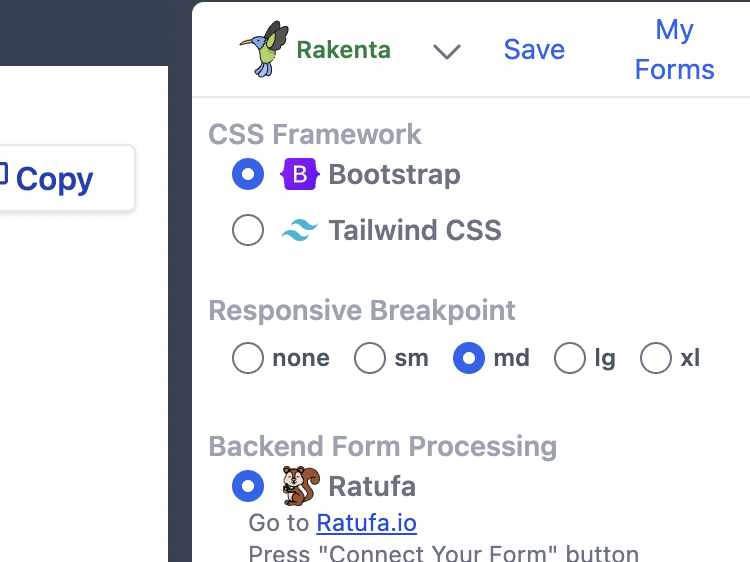
A responsive breakpoint is a specific screen size or width at which a website's layout changes to better accommodate the device being used. For instance, on a mobile screen, the form may switch to a single column arrangement.
In the "Code" tab, you can select the responsive breakpoint. The form will rearrange into rows of form elements when the screen size is smaller than the selected breakpoint.
Watch the demo here: